Have you ever been through a renovation, or had to make big decisions around how you want your house to look? It can be a pretty overwhelming process - exciting but also stressful, as these choices will ultimately determine the overall look and feel of your entire home.
We are smack bang in the middle of a major home renovation, and it feels like we have been making these big decisions for months! As we watch everything start coming together, I just can't wait to see what it will all look like in the end! Today I'm sharing all the decisions we have made for our new downstairs area, which includes the kitchen and living area. I'll be writing another post for our choices in the master bedroom, ensuite, walk-in robe and exterior areas, so stay tuned!
You may recall from my renovation progress 'report' a month or so ago, that we are creating a big open plan living space - combining kitchen and living areas by knocking down several walls. So the majority of our decisions were based around the layout and look of our kitchen, which was one of the first areas we focused on.
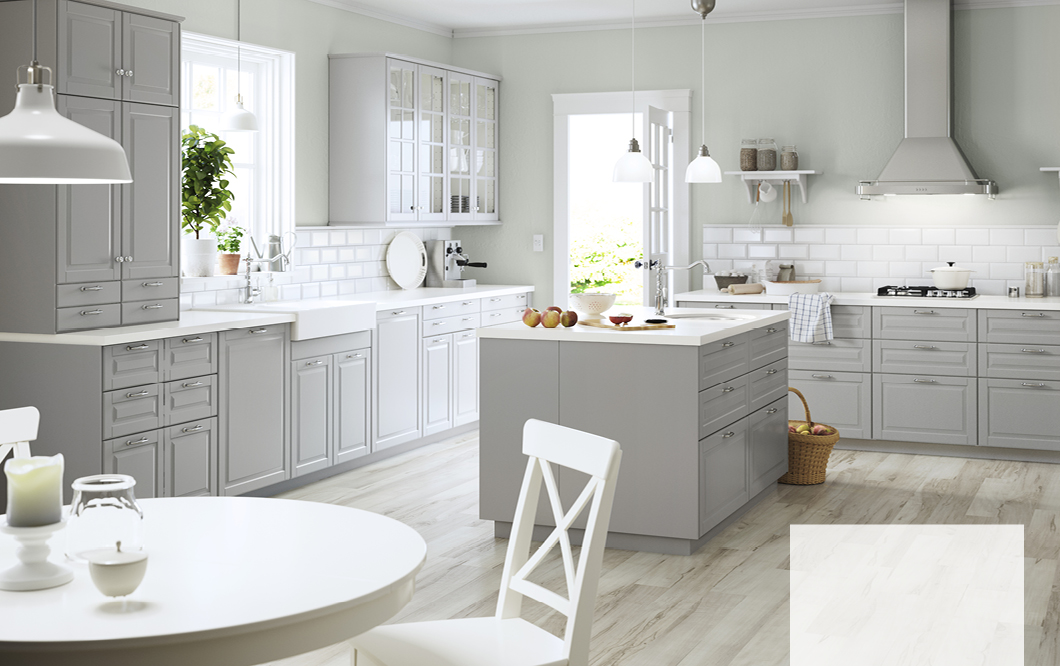
We went to several kitchen cabinet makers, but ended up going with the Bodbyn kitchen from Ikea - it is great quality, a great price, and exactly the look we were after (classic French Provincial style). We're going with off-white rather than grey, which was actually a lot darker than it looks in the picture below. Our kitchen will have a similar layout to this photo, but a more compact L-shape and our island bench will be triple the size of the one pictured. Woo-hoo for extra storage! My husband will actually be putting the kitchen together, which should be interesting.... hopefully not too complicated!
We'll have several of these glass doors along the top cabinets, which we'll use to display decorative items, glasses and mugs (still have my eye on these beauties, kicking myself for not grabbing them the day I saw them!).
Ikea's Variera range for organising drawers is beautiful and I've always wanted to use them but our previous kitchen drawers were too small. So with a recent 40% off sale, we jumped at the chance to stock up! The drawer dividers (top left) will work perfectly in deeper drawers where we'll store pots and pans as a divider for lids, or even just to section off the drawer so it can be organised into categories. We collected a few of the divided trays to organise utensils and cutlery as well as the knife tray, which we'll test out to see if it's a better option than our magnetic knife rack. If not, it's easy enough to pop that back up. We also grabbed some drawer mat to prevent everything sliding around inside the drawers.
In the corner cabinet, we'll be installing one of these Ultrustra base cabinet carousels that can pull-out and make everything super easy to access. Can't wait to try this one out! I've come up with a plan for what will be stored in the different cabinets of the kitchen, but I imagine there'll be a bit of trial and error to see what fits well on the carousel.
Our sink is the Domsjo double sink - I've always wanted a farmhouse sink and this one is nice and deep, but I am a bit worried that we don't have a draining area so still thinking about solutions for this problem. We're also going with the Elverdam kitchen mixer tap.
We had a bit of trouble with handles, as I'd always had my eye on a particular look, so we went to heaps of different places searching for the perfect ones. But either the colour wasn't quite right, or they were waaaaay out of our price range - who knew handles could be so expensive! We ended up going with these Varnhem handles, again from Ikea, as they are a nice shape and come in different sizes. A mix of these and the complimentary knobs will finish off the kitchen nicely.
We agonised over choosing the perfect oven, and spent months researching and reading reviews. Our specifications were free-standing, 90 cm, easy to clean, gas top, 6 burners. There were loads to choose from, but we just wanted to make sure it was exactly right for us. On the day we actually ended up buying the oven (and dishwasher and range-hood) from the store, the kids were being so crazy that it ended up being a really rushed process, as we just wanted to get them out of there! So hopefully we made the right decisions! Here's the oven we chose - a Westinghouse ceramic oven. It doesn't have a separate grill, but see that compartment underneath the door? It actually opens up so you can pop the grill inside while you're using the oven. Pretty neat feature!
This Ariston dishwasher is a quiet operator, can run half cycles, and has a 4 star water and energy rating, so pretty sure it'll be a winner.
We decided to go with an under-mount range hood because we didn't want anything too bulky. This Schweigen 90cm range hood fit the space, operates quietly and is easy to clean.
We're going with an interior waste sorting system to save floor space in the kitchen. The cabinet below the sink will have an electric push feature so if your hands are full and you need to put things in the bin, you can just push the door with your knee to open it! It's the little things... :)
The waste system will be divided into 3 sections for waste, recycling and compost. You can have all sorts of configurations to fit your space, so we're still playing around with this one.
In terms of bench-tops, Damian will be making the island bench-top from Tassie Oak wood. It's pretty long, around 2.8m, so it'll be quite a statement piece. This picture has long been our inspiration, but we'll go with a wood that's a little lighter...
The other bench-tops will be in quartz stone, and we're still deliberating on the colours below. It's so hard to make a choice based on the tiny sample they give you! I'm thinking we might wait til the kitchen is fully installed before making our final decision, but 'm leaning towards the top one - 'Amaretti'. What do you think?
Our splash-back will be subway tiles, and we're crushing on these white shimmery ones from our local tile store Yeomans Bagno & Ceramiche - they have an amazing selection (we also got our beautiful bathroom tiles from here). Again, this is a decision that can hopefully be made when the kitchen is installed so we can test a few sample tiles against the colour of the cabinets.
We found lighting one of the hardest choices, but decided to go with glass pretty early on as I've always loved the look of them, despite the negatives we've heard about maintaining them. It was a hard hunt, either the glass looked kind of dirty or smoky; the pendant had holes in the top for the dust to fall into and no way of cleaning the inside; or it was a slightly odd shape. After many different store visits and nearly buying several, I stumbled upon these classic antique pendants on sale at Temple & Webster and added 2 to my cart! Hoping they don't look too small in the space, because I really love them.
Pretty excited also to have stumbled upon these amazing finds on eBay - 8 perfect chairs in just the style I was after, and to save Damian having to build our dining table, we picked this matching one up from the seller on the day. It's an 8 seater that extends to seat 12. Score!
Our dining area will be right next to the bi-fold doors which lead out onto the deck, so we'll just be having down-lights over the whole kitchen and dining area, and not have an over-head pendant in the dining area, as we didn't want to restrict the space in which we sit to eat.
In the main room, with the high vaulted ceilings and exposed beams, we'll be installing some wedge lights from Beacon Lighting which will brighten the room without casting shadows from the exposed trusses. We'll also have a ceiling fan with a light in the middle - undecided about whether it should be white or stainless steel...
Speaking of those exposed trusses, I'm starting to get a better feel for how they're going to end up looking. We'll be using lining boards along the pitched ceiling, and thinking of white-washing the beams rather than painting them white, so it'll kinda look something like this:
Or this... Maybe. Still undecided!
Our stairs will be one of the final parts to be installed. Here's our inspiration for the final look, with the white risers and wooden treads. Love it! Although not particularly looking forward to painting them...
The final major decision for our downstairs area is the colour of the floorboards. They will be Tassie Oak boards which are a lovely natural colour, so we could just go with a clear matt finish, but I also really love the look of these smokier ones...
We're opening up our entrance-way, which currently has a corner jutting out, so the front door will be flush with the exterior walls and there will be a nicer flow when you walk into the house. I'm wanting to paint the front door a dark colour, perhaps a grey like this:
Or a blue like this:
I'm still deliberating on the exterior paint colour, it's doing my head in. But it really is amazing how a paint colour can look so different in different lighting. Some days it looks completely grey and I love it, and other days it has that tinge of blue that I'm not sure about. See what I mean from the pictures below? It could also be my phone camera throwing off weird over-exposed hues. We'll be applying the second coat this weekend, so I have until then to decide. Eek!
As I write this post, I'm realizing that we do still have quite a few major decisions to make, but at least we're narrowing things down, and I'm sure after so much deliberating that everything will work out beautifully. So super excited to get it all happening! Stay tuned to Thursday's episode of The Organised You TV, where I'll be taking you on a guided tour of the progress happening on the renovation - these things are sometimes so much better to see 'in person', so I'd love for you to join me!
I'd love to hear from you in the comments below...
Have you ever been through a renovation, and had to make loads of decisions?
How did you find the whole process?


