Is there a part of your home that's a real feature, which has that 'wow factor'? Be it an interesting layout, a unique piece of furniture, a striking paint colour or even an unusual print, having a stand-out feature can become a talking point and something that makes your home unique. With our newly renovated house, that wow feature is most definitely the exposed beams on our pitched ceiling. Today I'm showing you the whole process of how we exposed the beams. It certainly was not without moments of tears and frustration, but the amazing transformation was more than worth it!
Exposing the beams in the living room was actually a bit of a last-minute decision - my husband Damian brought it up the week before our final meeting with the builders as something he'd been thinking about, and this inspiration photo had me convinced it could be an amazing change for our living space. When we met with our builders for an in-depth discussion, we asked what they thought of the idea, as we were unsure of additional costs and whether it was actually feasible. After a quick inspection, they agreed it would be an absolutely awesome feature and not too expensive to add, so we decided to go for it!
Here's what the ceiling previously looked like in the living room, as you can see it was quite low.
Because you walk straight into our living room through the front door, we knew that exposing the beams in this section would make a huge impact. It's tricky to see in this photo, but we also pushed back that little alcove where the front door is so we had even more space at the entryway.
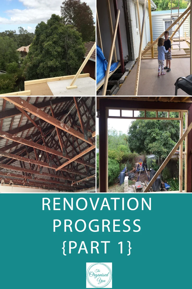
Two weeks into the build, we were told that we needed to move out, as the builders were ready to knock down the back wall and rip down the ceiling. I was surprised at how fast-moving it all was, and you can imagine how surreal it was to walk in at the end of the first demo day to see this! You can just see that main window (that had the curtains on it) covered by a black plastic sheet in this photo. I feel like the house looks so tiny in this photo compared to what it is now.
So this was my first look at the exposed beams. And honestly? I was freaking out. I thought they looked awful, and I just could not even begin to visualize the end results. To me, it just looked like a whole lotta wood! And the exposed white brick was really throwing me. So, while Damian was feeling totally pumped, I was quietly panicking.
On one of our first exterior painting sessions, we had lunch under the beams, and all I could apprehensively think about was just how much work it would take to get them looking any good.
The first stage for this part of the project was to complete the framing. We decided to go for lining boards on the pitch rather than plaster for a bit more visual interest, so the framing is what these lining boards would be attached to.
It was an interesting process for the builders to work out how to tie the pitched ceiling in with the new extension, which would be a flat ceiling. Basically that huge piece of red steel running across the length would become a bulkhead to make the space feel seamless. Of course, I still couldn't visualize any of it!
Then we found out all our floor joists were rotten, so not only was it intimidating to look up, we had a strong breeze coming through! Damian ripped up the floor boards with my Dad to save us some $$.
Once the yellow-tongue flooring was laid throughout, it finally started to feel like the space was coming together.
Next, Damian did a thorough sanding of the beams with an electrical sander. Hideous job. The beams were so rough that it literally took a full day to get them smooth. We then had to fill all the holes (there were lots!) and hand sand them so the beams would be completely smooth for the paint. Labour of love much?
While we were preparing the beams, the plaster was finally going up in this space - what an amazing transformation that was!
We could now start to see how these two spaces would work together.
The first coat of primer paint went on and I felt like we were making massive progress and we'd be able to 'smash it out' - our motto throughout the renovation - in no time at all.
The next stage for the builders was installing some heavy-duty insulation and attaching the lining boards, which was pretty fiddly due to having cut around all the beams.
Side-note: we were warned by some people that it would be difficult to heat this space due to the height of the ceilings, so we decided to add a fan for reverse heating. So far, we have not had any problems whatsoever, and have actually had the ducted heating on a lower setting even on cold nights, so we think the insulation is doing a pretty great job.
The lining boards had hundreds of nail holes, so I filled them all with wood-filler, and then hand-sanded them - that's me up there balancing on that terrifying beam! It was a horrible process, as I had to sand between the boards, which was super awkward and hard to get in to. A few tears of frustration were definitely shed at this point!
And then, the never-ending painting started! I'm taking credit for all the painting (along with help from my wonderful Dad), as I was on my own while Damian built the kitchen. The first job was painting those lining boards on the pitched ceiling, which was a neck-killer as it was so high and the huge extension pole was really heavy. Thankfully we had purchased the boards primed so I only had to do 2 coats. I then had to touch up all the spots I'd missed while balancing along that beam, and getting Damian to move it along from underneath every time I needed to change positions.
Around us in this living space, all sorts of exciting things were happening, like the stairs being installed...
The new flooring being laid...
And the plaster finally being finished.
All the while, I was painting these beams (in my super-attractive painting outfit!).
In the end, the beams took 5 coats of paint. Yep, 5. Because, of course, we didn't use the right primer, and then we didn't use the right paint for that kind of wood so the wood looked yellow and dark patches kept showing through no matter how many times I painted over it. It was so frustrating! #cuemoretears. In the end, after finally consulting with the paint specialists, we went with an enamel-based semi-gloss primer and with 2 coats of that, the beams came up beautifully....finally!!
Here's the end result - these pictures were taken on moving day when everything was clean and clear, and looking gorgeous!
I love the way the fan looks nestled in amongst the beams, and the bay window is now more of a feature in this space too.
The two spaces tie in really well with each other, and I am still marvelling at how our fantastic builders had the vision to pull this all together.
So that's a look at the whole process from start to finish - phew, I'm exhausted just writing about it! Ha. Totally worth all the hard work though, as it's a massive feature of the house now and I love how expansive the whole space feels now.
(P.S. If you're in the Melbourne area, and are after builders, the boys from IDbuilt are just fantastic, can't recommend them highly enough! Contact michael@idbuilt.com.au)


