For quite a few months, I've been feeling that The Organised You website was a little lacklustre and crying out for some serious sprucing up. Over the last few months, I've been making a list of all the things I wanted to change and recording exactly what was working, what wasn't, my goals for this website and a list of things I needed to do to make the changes. Which is exactly how I tackle the organisation of any space in my home. It's all in the planning, right?
So today I'm showing you around the new and exciting look that I've finally created! I wanted to show you exactly how these new changes can benefit you in order to create a better user experience, and maybe even discover a feature of The Organised You that you never knew existed! Here's a look at the changes I've made around here!
1 | Created a 'Start Here' page
There's nothing worse than coming to a website and not knowing exactly where to start in order to get the best experience possible. So I decided to add a dedicated 'Start Here' page (essentially a Home Page) in order to help you navigate easily around the site.
First of all, I wanted to make my free resources front and centre - there's far too much good stuff in these babies to risk missing them! Clicking on any (or all) of the 3 images will give you access to:
My free 7-day course called 'Create A Balanced Life' which helps you prioritise the things you want to do in your life, and help see the importance of organisation for your family and home
My kitchen organising cheat sheet, which is full of tips and strategies for getting your kitchen more organised and functional to reduce your stress, time and effort in this space
My Resource Library which has over 35 organising freebies, including checklists, guides, printables, templates and workbooks. Heck yeah!
I also wanted to add some updated photos of myself as it's been a while since my last photos. Photo shoot courtesy of my wonderful hubby xx
In the next section of the Start Here page, I wanted to highlight all the different things The Organised You is about, because it's more than just a blog! It's also a helpful how-to video resource with my episodes of The Organised You TV, as well as my home organising services, newsletter, products and blog archives. This section of the Start Here page helps you navigate all these different features.
2 | Added a Products page
I have had quite a few email inquiries lately asking if I offer any organising products - particularly from those people outside of Australia who can't access my organising services. So I wanted to create a Products page where I could house current and upcoming products.
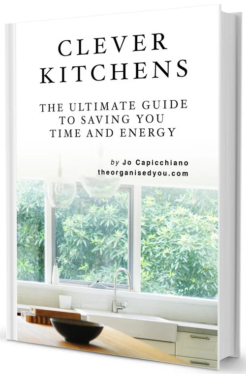
Here, you can access and find out more about my online guided course Chaos to Calm, as well as be the first-in-line for the upcoming release of my Ultimate Kitchen Organising Guide and video workshops. Coming soon! I've got so many more exciting things planned for release in the new year, so it's awesome to now have a dedicated spot to house them all.
3 | Added a secondary navigation
You might notice that there are pages to visit at both the top and bottom of the website now. There's lots of things I wanted to highlight, but didn't want everything squished together at the top. The secondary navigation at the bottom includes my:
Portfolio of client space makeovers (it's so fun to look back at these!)...
Blog Archives with all the blog posts from 2014-current all in one easy spot...
A look at my Favourite Organising Tools, plus my Contact page.
So that's it! I'm super happy with the new look to The Organised You website, and ultimately I really hope these new updates create a better user experience for you. Once you've had a look around the site, I'd love to get your feedback.
